What to do with the Eraser tool?

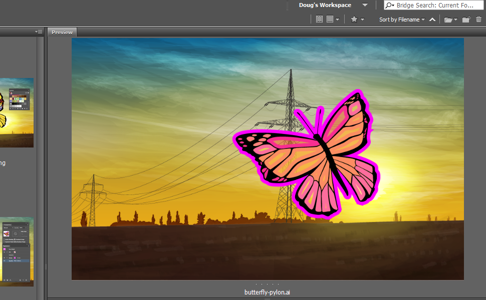
Most posts on Illustrator tools focus on the things they can do. I’m going to focus on what a tool can’t do.

The eraser attracts new users because it seems like it should be familiar from pixel-based software like PhotoShop and Paint. You draw things, you erase things — simple, right? But then of course the eraser becomes a large source of frustration, because it doesn’t work as you might expect. The reasons for this are found in some fundamental ways in which Illustrator works, which I’ll also go into. But first, a few scenarios where you might think an eraser tool would be useful.

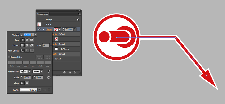
Erase rounded path ends or mitered corners

Sometimes you’ll end up with path end caps protruding from the edge of your illustration, or an excessive miter jutting out that you’d like to lop off, and need a way to shave them.

Erase part of an art brush

Illustrator comes with a bunch of nice painterly brushes, but sometimes you’re going to want to cut back into them and selectively erase long tails or otherwise neaten them up. Maybe you’re used to doing similar things in PhotoShop.

Erase the stroke on one side of a square

Probably a common thought: how can I get rid of only one side of a square, or part of another shape? Seems logical to just erase it, right?

Some bad news

The bad news is that the eraser tool can’t do any of these things! Not exactly as described, anyway.

You might justifiably ask: what is the point of it then? What can it do? The answers will be, I’m afraid, disappointing for most. But first I’ll discuss why it can’t do these things. As I said earlier, it involves a core concept in Illustrator: the difference between Objects and Appearances.

Objects and Appearances

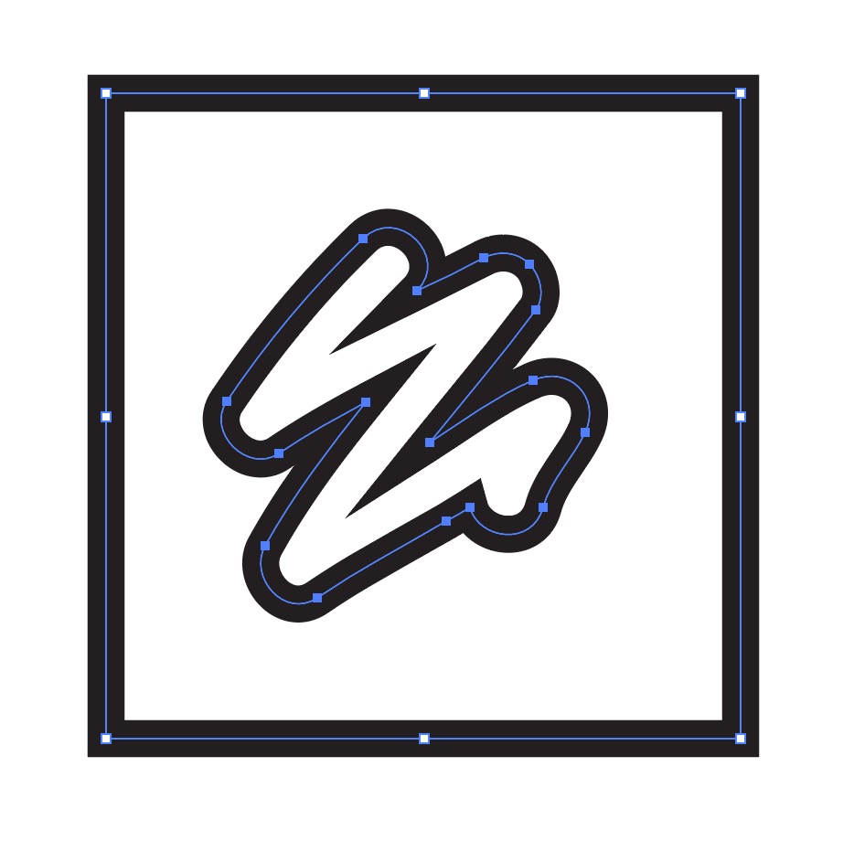
If you use Outline mode (found under the View menu, or Command/Control + Y), Illustrator presents you with the skeleton of whatever you’re drawing.

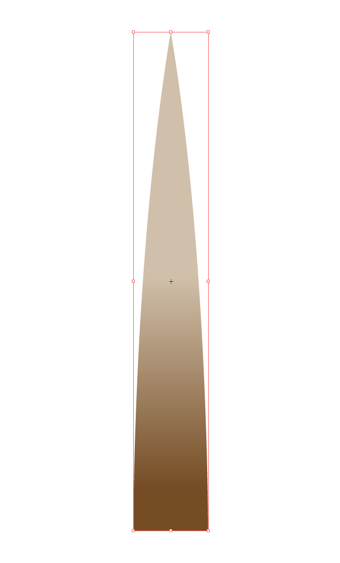
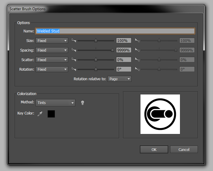
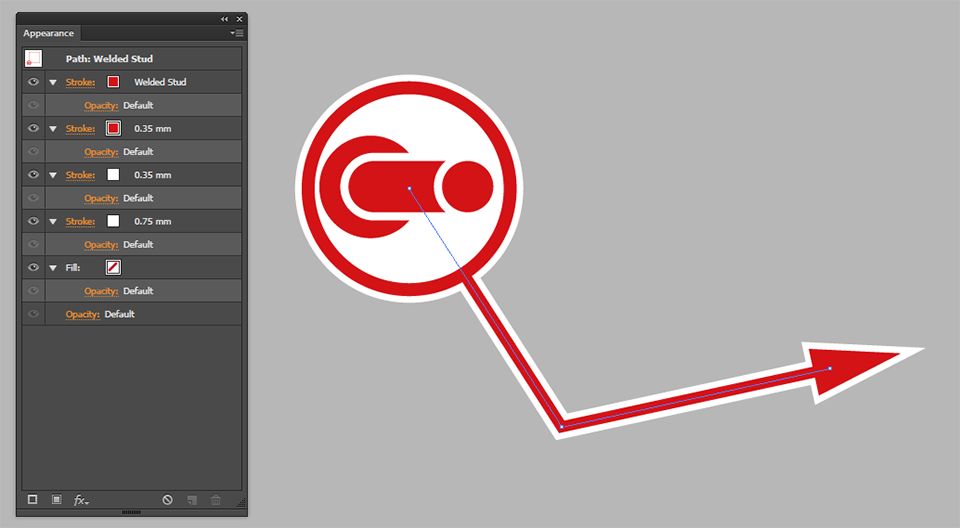
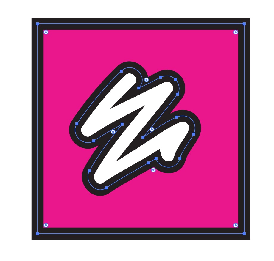
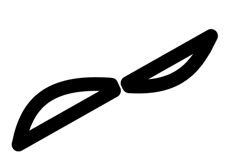
It’s a series of paths that have no visual information except a pixel-width line. The things you can no longer see are called appearances — everything you might find listed in the Appearance panel when you select an object. Consider this brush as another example:

The actual object here is the path going through the centre of the brushstroke; the brush itself is an appearance. What else is an appearance? Well, pretty much everything except the path: a fill, a stroke, a pattern brush, and a 3D extrude effect are all appearances. Almost everything you can see in Illustrator’s regular view mode (Preview) is an appearance.

As far as Illustrator is concerned, appearances aren’t ‘real’ objects — they only exist in relation to the path they’re applied to, and change dynamically as the object is moved or edited. You can nail them down by ‘expanding’ them, after which they become ‘real’ objects and can in turn have their own appearances applied. If I expand the brush above, I can then apply a brush to the outline of the brush, for instance.

How does this relate to the capabilities of the eraser? You might have already guessed, but just in case:

The eraser tool affects paths, not appearances.

It can’t affect a brush, a miter on a stroke, a rounded end, or anyting else that isn’t a path. You could erase parts of the underlying path in each of those situations, but the appearance would just be redrawn to match the new path. Let’s consider a few situations that commonly result in confusion for new users.

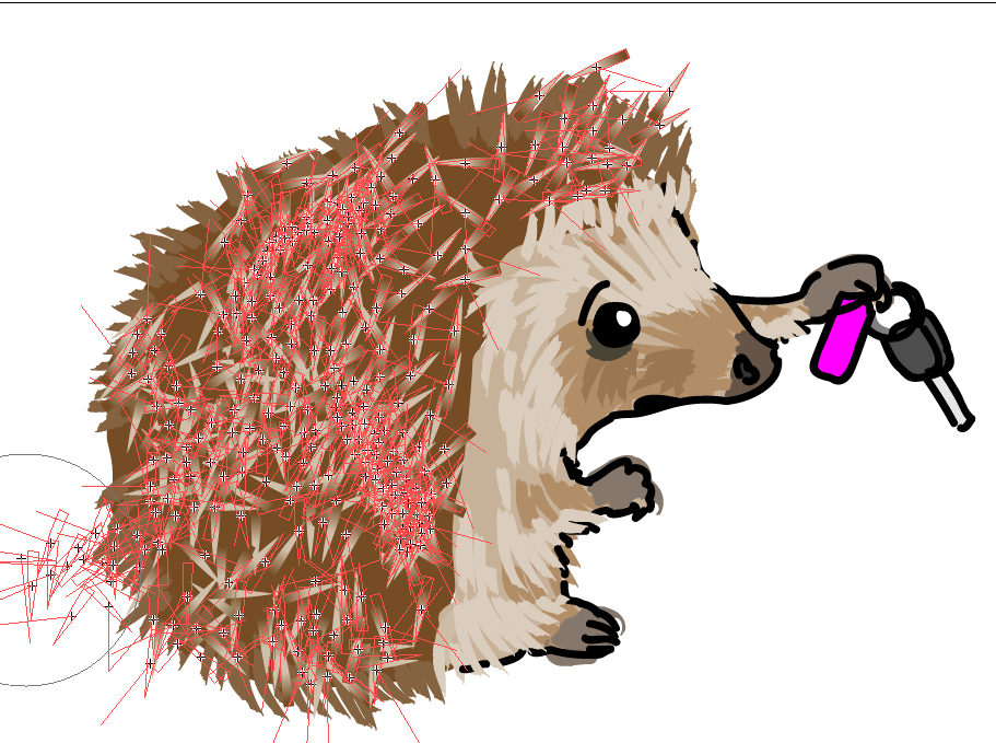
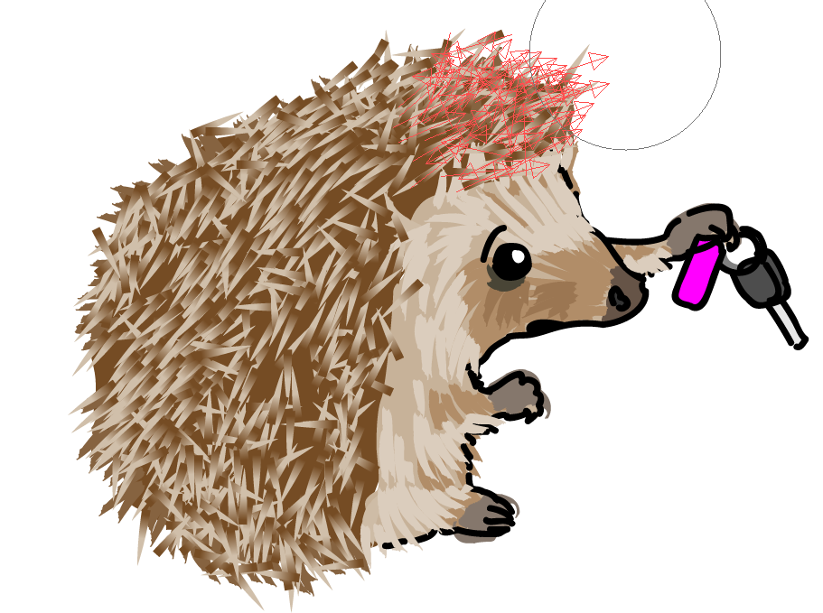
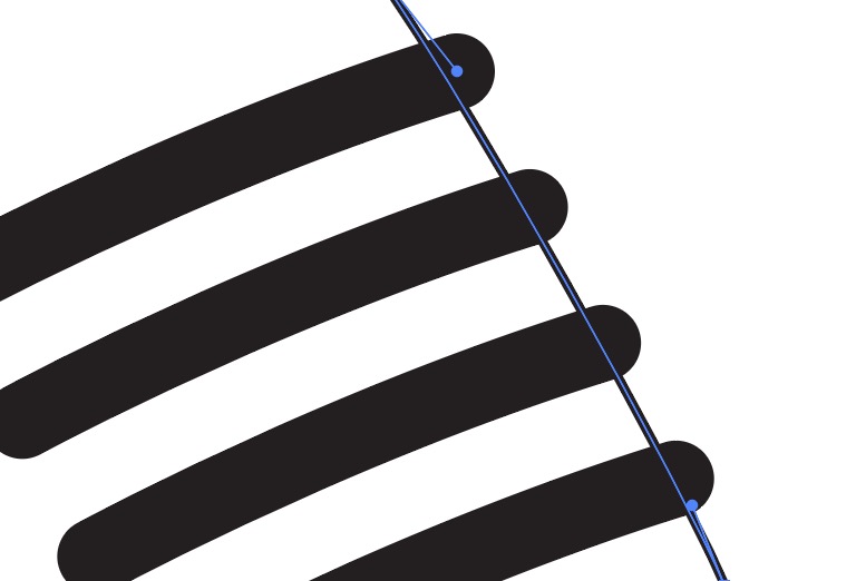
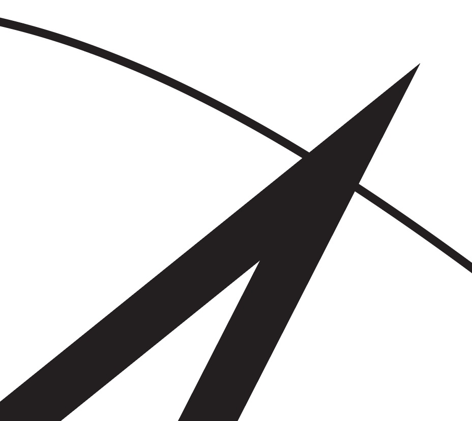
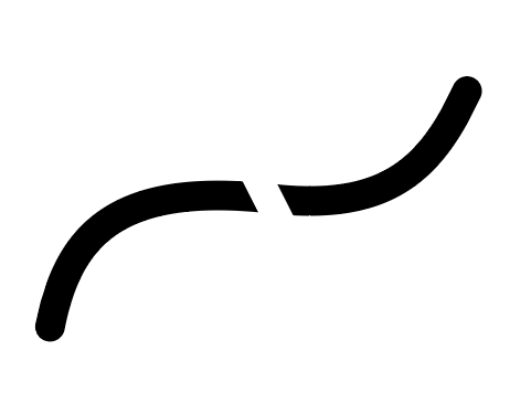
Problem 1: The eraser tool doesn’t erase my path cleanly

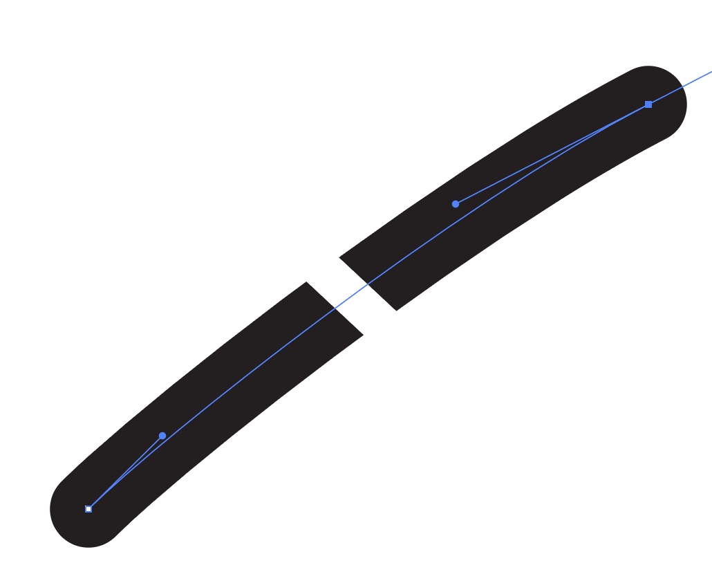
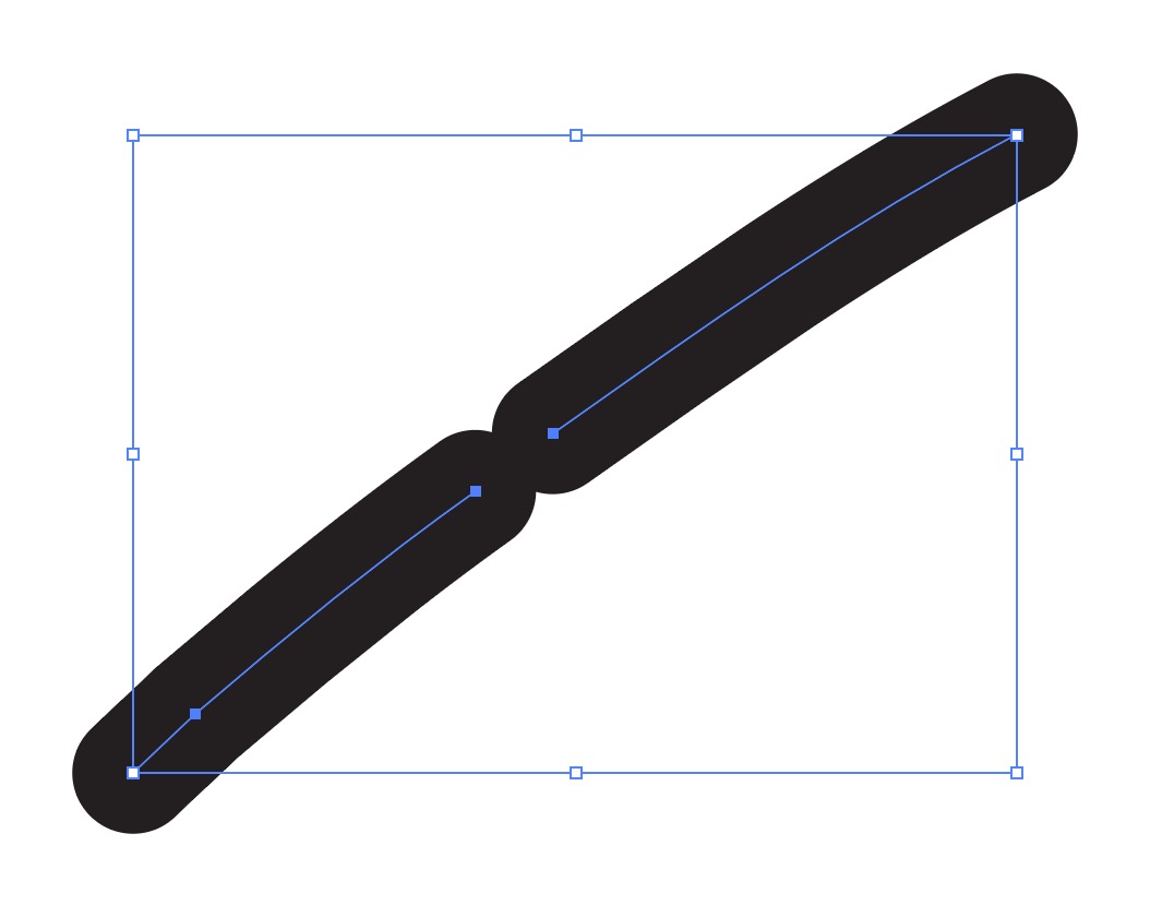
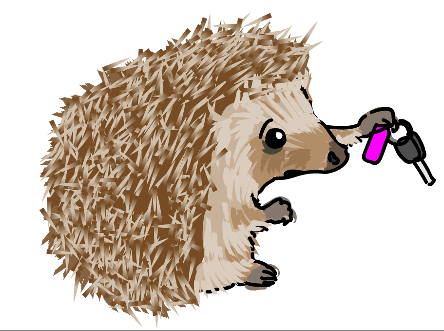
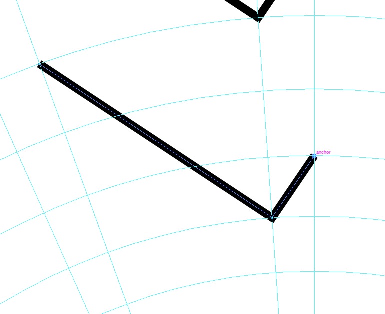
When you drag the eraser over a path, it creates a nice clean break — exactly what you’d expect from pixel software. But then you let go, and the nice clean break vanishes! It should be fairly clear what’s happened here from the second image. Your original path is quite thick and has rounded ends. The eraser has cut the path in two — and now you have two paths that have the same appearance as he first, including the rounded ends that encroach on the break you made.

This will also be true if you try and erase part of a path that has a brush applied:

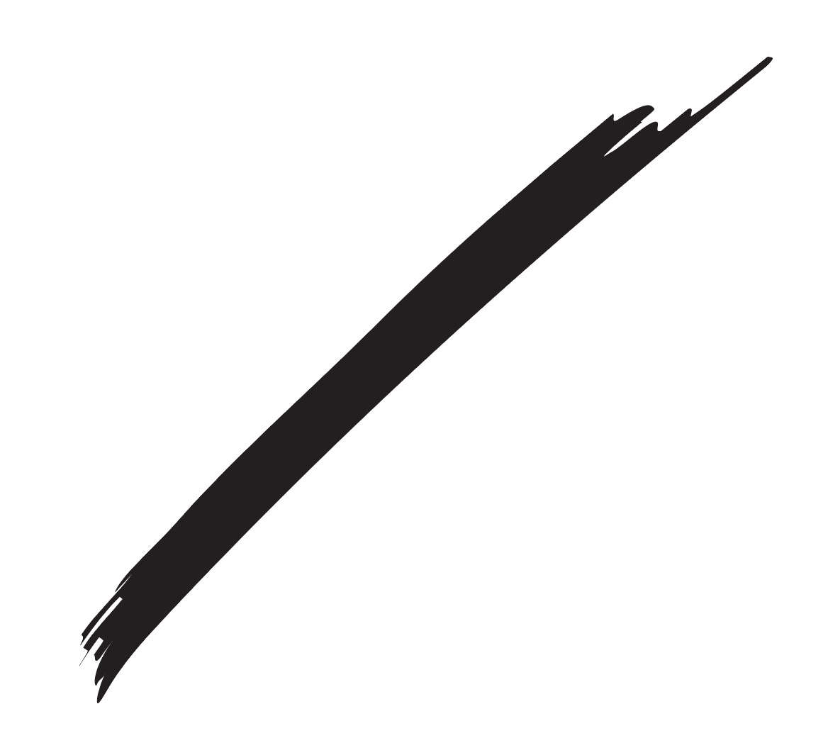
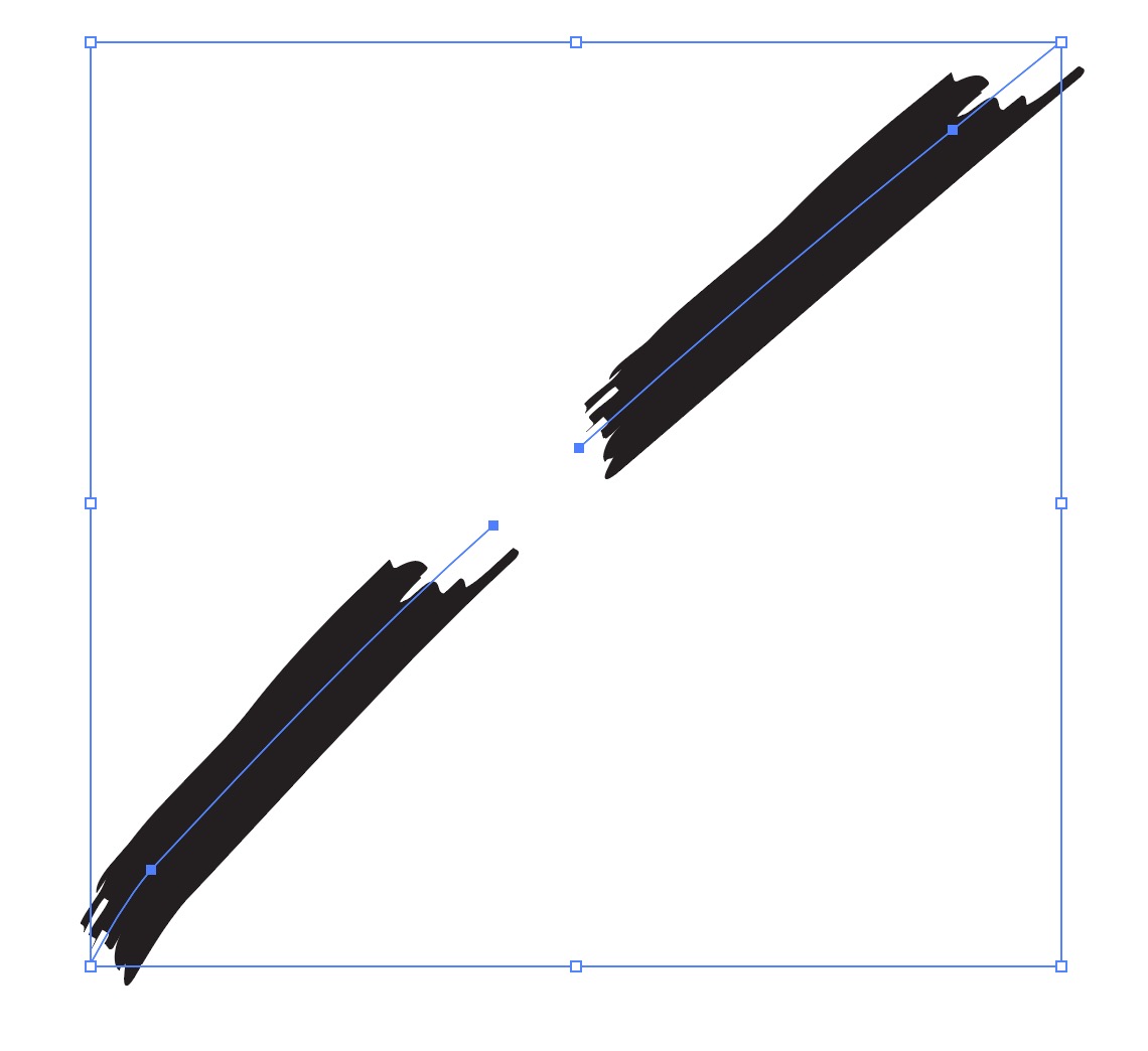
Run the eraser through the centre of this path with an art brush applied, and you now have two shorter paths each with the same complete brushstroke.

Problem 2: The eraser draws on my objects!

You scrub over a filled object with the eraser, but it ends up like the image on the left. What’s up with that? Just as before, the eraser is gouging out sections of an object that has a thick black stroke and a magenta fill applied. Where it bisects the object, it’ll create other objects with the same stroke and fill, so it’ll almost appear to be creating things rather than erasing them.

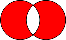
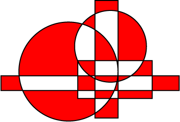
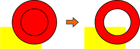
There’s a quirk of this in that it affects closed objects without a fill in the exact same way — so it seems like you can draw in completely blank space with the eraser, if it’s inside a shape with a stroke applied! This was created just by scribbling in the centre of the square with the eraser:

You can see what’s happening if I apply color to the result (right): it’s created a compound path from the ‘erased’ part, and the central part inherits the stroke from the original object.

Problem 3: The eraser closes my paths!

This only occurs if the original path has a fill (in this case a white fill). This is a common situation for new users because most Illustrator document profiles have a default graphic style that is a black stroke and white fill, and you might not notice the white fill unless you’re drawing on top of something. This is what the path looks like if we change the fill to red:

For some reason, instead of creating two open paths with the same fill and stroke, using the eraser unexpectedly closes the paths. I can’t think of a reason this would be desirable, but there it is.

So what is the eraser good for?

Very few situations, in my opinion. The common reasons a user might reach for the eraser tool in other software are best dealt with in Illustrator by masking, or as a last resort expanding appearances and directly editing them (but you’d better be certain that’s what you want before you do it).

If you’re dealing with objects that have a simple fill and no stroke or other appearance attributes to worry about, you might find it intuitive and simple to use the eraser. For instance, if you commonly paint with the blob brush, you might find the eraser a suitable counterpart. The blob brush is sort of like an eraser in reverse: it paints filled shapes with a calligraphic brush, which you could then cut back into with the eraser in predictable ways.

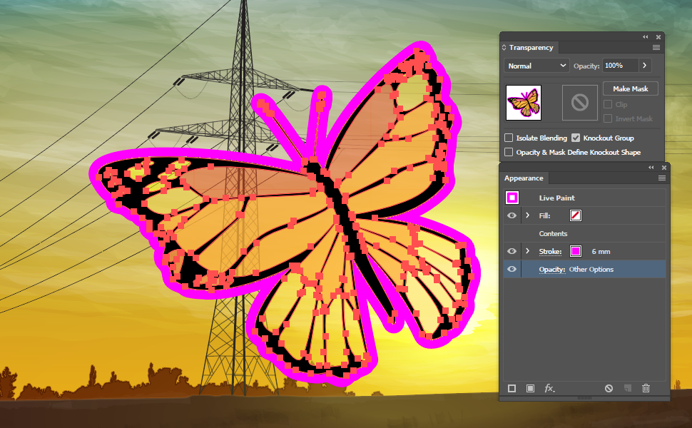
If you have an object selected, the eraser will only work on that, so it might be nice to neaten up your colouring under linework (if you have nothing selected, it’ll work on everything, so take care). But really, that’s about it.

Illustrator and Pixels

This will start out somewhat broad, but my main focus here is on those who are having trouble getting the pixel images they want out of Illustrator. There are many examples I’ve come across over the years of people having difficulty getting images out of Illustrator at the ‘correct’ size, especially in relation to PPI. It’s a common problem not because the users are at fault, but because Illustrator hides a key factor from them.

I’ll try and start at the beginning.

Vector and raster

These are the two primary ways of defining visual information using computer software. Basically for our purposes, “vector” means something is defined by coordinates, and lines or curves joining those coordinates. The coordinates are called anchor points, and the curves are called beziers. The curves are defined by control handles extending from the anchor points (longer handles mean more extreme curves).

An image of a bezier curve featuring anchor points and control handles in Illustrator, with annotations

“Raster” means something is defined by a grid. Within the grid, each square (or pixel) is assigned a colour value, and an image emerges from the arrangement of squares. This is the same curve as above, but the grid of pixels is much larger to make the construction more obvious:

A raster image of a curve, scaled up so that pixels are visible

In this case, the colour of each pixel varies from black to grey to white to give the illusion of a curve. There are roughly 50 pixels in each dimension, enough to describe basic shapes, but not much use for anything more detailed.

The point of this distinction between images defined by vectors and images defined by a grid is that you can make the vector image much larger and it’ll look just as detailed. If you make the grid image much larger, you’ll end up with larger grid squares. Here’s the same curve, the vector version on the left and the raster on the right:

Output

This isn’t really a fair distinction, but it is the impression many people have when comparing the two image types. It’s not entirely fair because virtually everything you produce in software ends up as raster of some sort. Vector software is really just another way of producing raster images.

Think of the end products of your work: if you are designing something for print, your vector image will be translated by the printer software into a grid that the printer itself represents in tiny ink dots. If you’re exporting a PNG or a JPEG, your vector image becomes raster at that point. Even if your image will always be viewed on screen as a PDF or an SVG or some other format, your computer monitor is a grid of pixels performing rasterisation. Vector and raster are most often two different points in the same process, rather than different processes entirely.

So why might you start the process with one over the other if both usually end up at the same point? For raster, there are many image types that are just more efficiently represented as pixels than vectors. You might think of a set of vector shapes as paper cutouts placed on top of one another. To create a really detailed image, you might need many thousands of complex paper cutouts, to the point where the image is much more mathematically complex than a grid of pixels, even millions of pixels. Thus, realistic photos are almost always easier to represent with pixels than vectors.

The main point of vector files is that they can be the source of many different sizes of raster output. From a single vector drawing, you could output a 16×16 pixel favicon, a 500×500 company logo for a website, and a 2 metre wide banner.

Illustrator’s Units

I mentioned earlier that every anchor point in Illustrator is defined by coordinates. Those coordinates are based on a unit of real-world size: the point. This is the same point you use to define the size of type, and as far as modern software is concerned, a point is 1/72 of an inch. The actual unit Illustrator uses is vastly smaller than that (I don’t actually know the accuracy limit, but there is one), but it is some tiny fraction of a point. If you set the units in Illustrator to something else like centimetres, it’s still converting those from fractions of a point behind the scenes.

This is still the case if you tell Illustrator to use pixels as your unit.

This is a crucial point to remember. If you’re following this, you might be aware that a pixel is not a unit with a definite size. Your monitor might have 1080 rows of pixels from top to bottom, but it could also be a 13-inch laptop screen or a 60-inch TV with the same amount. If you have a pixel image, you can still scale if as we did above, so each pixel is much larger or smaller than it was originally defined.

Illustrator does not care about any of this. When working within Illustrator, a pixel is exactly the same thing as a point — 1/72 of an inch.

The reasons for this are historical, and outside my scope. But this is what we have to work with.

Pixels Per Inch and Dots Per Inch (PPI and DPI)

You may have heard one or both of these terms used in reference to pixel images, because they’re used almost synonymously, but Pixels Per Inch is what we are concerned with. It means, perhaps obviously, the number of pixels in each row of an inch. DPI is primarily a printing term, referring to printer dots per inch, and strictly speaking is irrelevant here, but people do use it to refer to the same thing as PPI on occasion. In the below example, 1 inch is 10 pixels across, resulting in a resolution of 10 PPI:

A representation of 10 pixels per inch

Of course, it’ll only be actually one inch across if you have a particularly small monitor, but I’m not in control of that.

Illustrator, therefore, uses a resolution of 72 PPI if you work in pixels. This doesn’t mean that your work is 72 PPI within Illustrator – as vectors, your work is independent of resolution – but that if you were to export a file one inch square at 100% size, that image would be made up of 72×72 pixels.

Pixels and Physical Sizes

In the requirements for image sizes for either print or screen use, you might see three variables used: the pixel-by-pixel size (“500 x 300”), the resolution (“300 PPI”), or the physical size (“4.23 x 2.54 cm”).

All of these are interdependent:

  1. If you know the pixel size and the resolution, you know the physical size (if an image is 300 pixels tall and 300 PPI, it can only be one inch tall).
  2. If you know the resolution and the physical size, you know the pixel size (a one-inch tall image at 300 PPI is 300 pixels high)
  3. If you know the physical size and the pixel size, you know the resolution (a one-inch tall image that is 300 pixels high has 300 PPI).

Generally speaking, if you’re making something for on-screen use, you don’t need a physical size. Only the pixel dimensions are important, because they’re the only things relevant to a screen (because an inch might be made up of any number of pixels on different screens). This means PPI isn’t necessary either, because without a physical size, there is no way to define it.

If you’re going to be printing something, you need the physical size and the resolution. We’ll go through scenarios for both of these.

A Raster Image for Print

Usually if you’re printing, you’ll want to supply a PDF or the AI file itself to the printer, so that the printer itself can perform the rasterisation at its native resolution. But occasionally, you may need to produce a raster file at a specific physical size (for example, to supply a rather inflexible online service). Sometimes, these requirements can seem at odds with what Illustrator can produce — if, for instance, you’re asked for a 5000 x 3000 JPEG file at 300 PPI.

Logically, you might then create a new file, select pixels as your unit, and enter 5000 and 3000 for the height and width.

Illustrator new document settings for a 5000 x 3000 pixel image
‘Raster Effects’ refers to the resolution of effects such as drop shadows — it has no effect on any overall ‘document resolution’

Then, you might go to Export As… and select 300 PPI.

Illustrator export settings for a 300 PPI JPEG

But if you check the resulting file in Bridge or Photoshop, you’ve created something vast!

Image Size infornmation in Photoshop

20834 x 12500 pixels! That’s a huge image, and far larger than you intended. What has happened here?

Remember the relationship between physical size, pixel size, and resolution. We can work out that a 5000 x 3000 pixel image at 300 PPI must be 16.666 x 10 inches. But that’s not what we’ve ended up with — that image is 69.44 inches wide. What’s happened is this:

Because of the relationship between points and pixels, Illustrator has already defined a physical size.

When you create a document 5000 pixels wide in Illustrator, you’ve created one 69.44 inches wide. This is because Illustrator assumes there are 72 pixels to an inch. There’s nothing you can do to change this inner working; you just need to be aware of it if you’re producing anything in pixels.

When you export that document at 300 PPI, Illustrator isn’t exporting a 5000 pixel image, it’s exporting a 69.44 inch one. 69.44 inches at 300 PPI is 20834 pixels — the number we see in the resulting image above. We could even go so far as to state the following:

Illustrator has no concept of pixels. A ‘pixel’ in Illustrator is just a point in disguise.

What do we need to do, then, to create an image of 5000 x 3000 pixels at 300 PPI? We need to apply what we know:

  1. There are only physical units in Illustrator
  2. If we know the pixel size and the resolution, we know the physical size

All we need to do is divide the pixel dimensions by 300 to get the dimensions we need in inches. This means we want a document of 16.666 x 10 inches. This, therefore, should be the starting point, not the pixel dimensions.

If you create a document of those dimensions and then export using 300 PPI, you should end up with a 5000 x 3000 pixel size.

A Raster Image for Screen

So what about a situation where you simply want a pixel dimension? Should you use pixels as a unit in Illustrator then?

The answer is yes — as long as you export at 72 PPI.

This means that the dimensions you use as your Illustrator document will be the same as those that export. The PPI itself is irrelevant — all you want are those pixel dimensions to be correct.

Document profiles in Illustrator

One of the most common questions people ask about Illustrator is: how do I make my custom swatches and styles available in all my documents?

If you just want the answer, scroll all the way to the bottom (or click here) and follow the steps. But if you want some background and a more complete understanding of the processes involved, just read on.

Most probably already know you can make libraries, but I’ll quickly go over those to start us off. A library file is simply an Illustrator file (apart from ASE files; which are transferrable between Illustrator, InDesign, and PhotoShop, but that’s another story). If you pay a visit to the menu of your document swatches panel and open any random AI file from the ‘Open Swatch Library’ option, a library will open containing the swatches from that document. This works the same for opening brush libraries, graphic styles, and symbols.

But opening a library file doesn’t affect the swatches, styles, or brushes in the document you’re working on: all you’ve done is open a small portion of another AI file in a separate panel. If you select a swatch from that library, it will add itself to your open document, but until you do that the swatch doesn’t exist for the purposes of things like Recolor Artwork or setting up actions.

If you’ve used libraries in this way, you might have noticed that the panels disappear when you close and reopen Illustrator. There’s a simple tick box marked ‘Persistent’ in the menu for library panels that solves this, assuming there are libraries you will always want open.

An example of an Illustrator library panel

If you want libraries to be quickly accessible, but not necessarily permanently on-screen, they can be accessed via the Window menu if they are stored in specific locations. At the bottom of the Window menu, you’ll see sub-menus for Brush, Graphic Style, Swatch, and Symbol libraries.

Navigate to graphic style libraries in Illustrator

Any libraries stored in the relevant folder at the following file paths will be available in these menus:

Windows 10: C:\Program Files\Adobe\Adobe Illustrator CC 2019\Presets\en_XX

Mac OS 10.13: Macintosh HD/Applications/Adobe Illustrator CC 2019/Presets/en_XX

(Where ‘en_XX’ is your language version: mine would be en_GB; a USA user en_US)

These files are also available from the libraries button at the bottom of each panel.

The libraries button at the bottom of each styles panel in Illustrator

There is one small problem with storing library files in this location: when you update Illustrator through a major version change, these files won’t be transferred between versions! If you keep libraries here, you need to be prepared to keep the previous version of Illustrator around and transfer your old library files to the new on manually. To get around this, you can keep files in a separate location in your user directory. At the bottom of these menus, you’ll see a submenu called ‘User Defined’. This points to the following file paths:

Windows 10: C:\Users\Username\AppData\Roaming\Adobe\Adobe Illustrator XX Settings\en_XX\x64

Mac OS 10.13: User/Library/Application Support/Adobe/Adobe Illustrator XX/en_XX/

(Where ‘en_XX’ is your installed language version and ‘Adobe Illustrator XX’ is your Illustrator version: the 2019 version of Illustrator is 23)

Here you will see folders for Brushes, Graphic Styles, Swatches, and Symbols, among other assorted settings. Library files stored in these folders will be visible under ‘User Defined’.

Navigate to user defined libraries in Illustrator

While libraries are very useful things for organising sets of styles and swatches, each still exists separately from whatever Illustrator document you have open until you manually add it. What if you want a particular swatch, for instance, to be available in every new document you create from the start?

Let’s go back to that user directory folder. In it, you’ll see a folder called ‘New Document Profiles’.

The new document profiles folder location in Windows

If you open that, you’ll see a selection of Ai files named things like ‘Art & Illustration’, or ‘Mobile’. You might recognise them from the ‘New Document’ options window in Illustrator. They are document profiles, and they form the basis of every new file you make.

In a similar way to libraries, document profiles are just regular AI files. When you tell Illustrator you want it to create a new document, it gives you a set of choices based on the files in this folder. A new document will ignore layers and actual vector content, but will use the artboard size, the colour mode, and (crucially) the styles and swatches from the document profile you select. You can probably see now how you’re going to proceed: either save an AI file to this folder to use as your preferred new document profile, or update one of the existing files to contain your swatch or style preferences.

Before CC 2015 or thereabouts, selecting a new document profile was rather simple. A drop-down list was available with each file in this folder listed. Choose one, and its artboard settings and colour mode are applied (though you may change them), and all its styles and swatches are available when the document is open. It still is this simple if you choose “Use legacy ‘File New’ interface” in the Illustrator preferences.

The preference for the legacy file new window
Side-by-side comparison of the new document profiles folder and the list in the new file window
[Custom] is displayed if you choose a profile and then change settings such as artboard size or colour mode — but the profile you chose still gets used! Beware choosing a profile set up in RGB and changing the color mode to CMYK especially

Around version CC 2015, a new ‘File New’ window was introduced across PhotoShop, InDesign, and Illustrator. It’s a bit flashier, and muddies the waters when selecting a document profile somewhat. They’re all still present, but they are lumped in with the ‘Size’ choices. Note that in the old-style window, the document ‘size’ is a list of preset sizes associated with each profile, so the ‘Print’ profile has these sizes associated with it (if you create a new document profile, it’ll inherit these from the original file it was based on):

The list of size presets for a document profile in Illustrator

In the new-style window, first we choose a category. This is equivalent to choosing one of the document profiles supplied with Illustrator. The preset sizes are visible as buttons in this category.

The new-style new document window

You’ll also see Adobe Stock templates, but we will ignore those of course. Click ‘View All Presets’ and the rest of the size options appear, plus any document profiles you have created from the ‘master’ file for that category.

Note that the ‘master’ file doesn’t appear except as a category to choose sizes from, but any new document profiles you make will appear.

In this example, I have made a document profile named ‘TEST’ from the print preset and saved it to the document profiles folder:

Document presets in the new-sty;e window

You can tell it apart from the size presets by the icon:

Each category (or ‘master’ document profile) has its own icon for size presets. Above is the icon for print; ‘Mobile’ uses a phone; ‘Film & Video’ a screen with a play symbol; you get the idea. But regardless of category, document profiles will have the pencil and ruler icon above.

If you’ve been following closely, you should be able to see how you can start any new document with your preferred set of swatches or styles, but I will attempt to summarise it in steps.

  1. Create a new document in Illustrator. Choose the existing document profile that best suits your needs; for instance, choose a Print profile if you’re going to be using CMYK colour and physical units of measurement such as inches.
  2. With your new blank document open, add any swatches, graphic styles, brushes, or symbols you want to include, from existing libraries or other documents. You can do this by simply clicking on a style or swatch in a library window.
  3. Add or create any character or paragraph styles you want to use.
  4. Change the artboard size if you wish.
  5. Save your file to this location:
    1. Windows 10: C:\Users\Username\AppData\Roaming\Adobe\Adobe Illustrator XX Settings\en_XX\x64\New Document Profiles
    2. Mac OS 10.13: User/Library/Application Support/Adobe/Adobe Illustrator XX/en_XX/New Document Profiles
  6. The next time you start a new document, choose your document profile from the drop-down list in the old-style window, or from the category of the profile it was created from in the new-style window. You’ll see all the swatches and styles you added right from the start.

A title column in InDesign with just styles

header image

I treat every InDesign document I make as a challenge. The goal of that challenge is to control everything with styles; if you can make a document with no local formatting, and no manual placement, then anyone can take it away and use it once you’re done. 99% of the time, this isn’t possible — there is almost always something to do after the scaffolding has been erected, some tweak the client needs that just can’t be consistent with everything else, or some design element that InDesign can’t quite achieve without your intervention. But many things are possible because of the vast amount of ways you can combine the options in styles, some of them unexpected.

A title offset into its own column is something you might want to do for subtitles, quote callouts, or any situation where text that is supplementary to the body might be needed. Like many things, it can be achieved in a number of ways, but as you might have guessed we are going to do it with just styles. Up to a certain point, the process is simple — combine complementary indents with a baseline shift — but there’s a trick towards the end that I must credit to the brilliant Michel Allio, alias Obi-wan Kenobi. Have a read of this thread if you want it spoiled for you:

Column for heading, column for body text? – Adobe Forums

If you’d still like me to break it down for you, read on. I’m going to start by presuming you have some text you need to set; mine is something from Project Gutenberg. I’ll also presume you have some knowledge of InDesign.

The first thing we need is body text with a left indent large enough to create space for the titles. Create a paragraph style and give it a useful name; mine will just be ‘Body text’. Apply it to your story and then open up the indents and spacing options.

right indent body-para window

right indent body_Artboard 1

If you’re following along, set this to 50 mm. If you have your own layout in mind, set to whatever fits. The other settings are just things I added as I went along; they aren’t important for the effect.

Create another paragraph style for the titles. Mine is called ‘Offset title’, but make it whatever fits your particular schema. Apply it to your titles. Now the real work begins.

One thing to note at this juncture is that the titles are, and still will be, part of the same story as your body text. They will occupy that space in between the body text paragraphs, even when it appears as if they are sitting alongside them. So, the first thing we need to do is ensure they do not visibly occupy that space, so that they don’t affect the space between body text paragraphs. To do this, they need to have leading set to zero — and, if you used another style as your source for this, ensure they have ‘space after’ set to zero too.

leading-0

Note that there is still space between body paragraphs here because I have it set that way in the body text paragraph style.

Before we move on, you may or may not notice that there is still space for the title text at the top of your text frame. This is because the ‘first baseline’ setting in the object style for the frame is probably set to ‘ascent’, which means it looks at the ascending characters in the typeface you’re using and sets the baseline as distance from the top of the frame to the bottom of those. We want it set to ‘leading’, which naturally means it is set based on the leading of the paragraph style you’re using. Since that is zero, the baseline sits exactly on the top edge of the text frame.

first baseline

But the text still appears above the body text, and we want it alongside. For this, we need to apply an appropriate baseline shift to the offset titles paragraph style. If the titles and the body text are the same point size, this shift should look correct if it’s the same as the leading of the body text. The body text has leading set to 15 points. Set this as a negative value in the advanced character formats for the offset titles.

baseline shift

You may well want to increase this value so the top edges of the titles and the body text line up if you increase the size of the title text, but we can worry about that after learning the principles. With no leading and a negative baseline shift, the titles and the first line of body text will now overlap. We will stop this with a large right indent applied to the titles.

right indent

With no leading or other spacing, the paragraph just overlaps itself when it breaks lines! Solving this is the trickiest part. To do it, we need to create some new character styles. There needs to be as many character styles for this as there are lines on text in the longest title, less one; I expect my longest title to break into four lines, so I create three styles, named Line 2–4 (omitting line 1 because this will be controlled by the paragraph style alone).

Each of these needs to have a baseline shift applied that is a multiple of that of the paragraph style: Line 2 should have double (30 pts), Line 3 triple (45 pts), and so on.

character style

This is because these character styles are going to imitate leading for us, using line styles. Open up the paragraph style window for the titles again, and go to ‘drop caps and nested styles’. At the bottom you’ll find line styles. Add one using the style ‘none’ and set it to run for one line, then another using the style Line 2, again for one line. Repeat for as many lines as you need.

line styles

If you have ‘preview’ ticked, you’ll see the lines arranging themselves as you create each line style.

That’s basically it! Like many complex styles, it’s some work to set up, but of course if you do it right, you won’t have to set it up again. If you want to use larger text in the titles (as is likely), you will need to adjust the baseline shift settings for the title paragraph style and each character style to match. This example uses 24 pt type, and so has a shift of -24 in the paragraph style, and -48, -72, and -96 in the character styles.

final

Varying Transparencies in Live Paint

Something I hadn’t considered before it came up at work was that it might be useful to sometimes have areas of varying transparency in a single live paint group. Live paint is a useful shortcut in Illustrator that people probably take for granted now, but it was probably originally a way of making things in Illustrator a bit more Photoshop-like for newcomers. Before live paint, you’d probably construct everything you needed to fill as a closed path, which makes a bit of planning and close attention to the stacking order of objects essential for complex drawing. With live paint, you can just draw and let those things take care of themselves for the most part. Read up here if you’re unfamiliar.

Anyway, one thing you can’t do without breaking your live paint group into separate closed paths is adjust the transparency of individual filled areas. Not in the usual way, at least. You can still select individual paths (and the fills themselves with the live paint selection tool), but if you look at the appearance panel you’ll find you still just have the live paint group selected — there’s no way to add a stroke to an individual path either. Take this giant butterfly:

An image of a butterfly against a background of the sun setting behind pylons. This image will be used to demonstrate varying transparencies in live paint groups.

He’s a live paint group, of course. Say I wanted his colourful wing segments to appear transparent, but the dark areas to remain opaque. The first clue as to how you can go about this is here:

The butterfly image as a live paint group filled with various patterns

You can fill a live paint group with anything in the swatches panel, including patterns and gradients. Patterns can be transparent!  In fact, if you make a transparent filled object and drag it to swatches, a pattern swatch is what you get:

Creating a pattern swatch with transparency

It’s just colour; it’s only attribute as a pattern is that it has 50% opacity. So naturally, you create a set and colour away with the live paint bucket.

The butterfly live paint group, filled with some transparent pattern swatches

Looks delightful! However, there’s one pitfall I’ve found of this method. It’s quite a niche situation, but could be critical if you fall into that tiny niche and can’t figure out what’s wrong. Say you wanted to add a stroke around your butterfly. You’d add it in the appearance panel, drag it below the live paint contents so it doesn’t visually cover the whole group, and then set knockout group so it doesn’t show through the transparent areas (read more about the very useful option knockout group here).

butterfly-pylon5

Pretty silly, but that’s what you want for some reason. Looks fine in Illustrator, but you’ll get a hint as to what’s wrong with this if you check a preview of it in Bridge or your OS:

butterfly-pylon6

You can see the stroke through the transparent areas! Knockout group should prevent this, but for some reason it doesn’t. You’ll see the same thing if you place the AI file in InDesign, or if you export a raster file such as PNG. This is because other applications can only view the PDF side of the AI file, and while this method works fine in Illustrator, something evidently gets lost in the translation to PDF. This isn’t great news if you actually need to produce something using this method!

Fortunately, there’s another way. Remember that you can add gradients to the swatch panel too, and these can also contain transparency. Obviously you could have any combination of transparent gradient stops, but if you just want to replicate what we’ve made above, you’d need a gradient with two identical stops, with the same opacity setting.

butterfly-pylon7

A bit of a pain, and rather odd, But for whatever reason, this setup translates fine into the PDF, and makes an image created in this way usable elsewhere.

Compound paths and you

Compound paths are a fundamental aspect of Illustrator drawing (and other vector drawing), but given the amount of questions I get about them at work, perhaps not intuitive to understand. I made this as a brief run-down of how compound paths work and how to work with them for my colleagues; maybe you’ll find it useful too.

For the most part, compound paths are about making holes in things. Here the two circles become a compound path; the smaller circle cuts its area out of the larger one, and you can see the yellow box in the centre as a result.

Asset 1@2x-8

Make a compound path by selecting the objects you want to become one and use the menu via Object > Compound Path > Make, or press Ctrl + 8.

Asset 13@2x-8
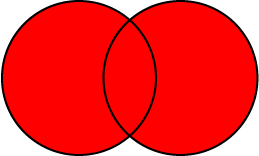
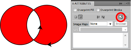
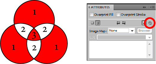
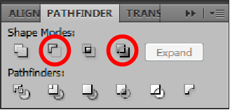
The Pathfinder can also be used to make compound paths. In this case, Minus Front and Exclude would have the same effect as above.
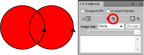
You can use any number of shapes of any complexity in a compound path with the same effect. You can also use shapes that overlap each other − but that’s where things get more complex.

Asset 3@2x-8

Here two overlapping circles form a compound path. The area of their overlap is excluded from the shape’s fill, as you might expect:

Asset 4@2x-8

But these circles are also a compound path, and their entire area is filled, including the overlap. What’s going on here?

Asset 5@2x-8

The answer lies in the relative directions of each circle’s path. Every path has a direction, usually going from its start point to end point. In closed shapes made with the shape tool, the direction is anticlockwise. Here I have given each circle an arrowhead so we can see the path direction:

Asset 6@2x-8

Compound paths, by default, use something called the Non-Zero Winding Fill Rule to determine which overlapping areas are filled and which aren’t. You can see this in the Attributes panel. In two newly-compounded shapes, the bottom one in the stack order will reverse direction, and the opposing directions of the two paths result in the overlapping area being excluded from the fill:

Asset 7@2x-8

You can change the direction of a path in the Attributes panel too. Direct-select one of the paths and use the Reverse Direction button (this only applies to paths as part of a compound paths; reversing the direction of regular paths is possible via the menu Object > Path > Reverse Path Direction). As the paths are going in the same direction, the rule determines that the overlapping space is filled:

Asset 14@2x-8

Note that shapes that have been ‘uncompounded’ (that is, released) appear to remember that they had their path directions altered and honour that setting − so effects like the lower path reversing direction might not occur if they are incorporated into other compound paths.

The Non-Zero Winding Fill Rule has a limitation shown here. What if three or more shapes overlap? They can’t all go in opposite directions, right? So some overlap areas end up filled while others aren’t.

Asset 8@2x-8

For situations like this, there is the Even-Odd Fill Rule. Here path direction is irrelevant and what matters is the number of objects that overlap. Odd numbers of objects will create filled areas, and even numbers unfilled areas.

Asset 9@2x-8

In some cases, it might be necessary to switch rules to ensure the effect you want, especially in objects with many shapes, where the Non-Zero Winding Fill Rule may create unpredictable results.

Asset 10@2x-8

Consider this situation. There are several red shapes on top of the large red circle in the stack order, but a single green square below it. When you make a compound path from the shapes within the large circle’s area, only the bottom square is excluded from the fill and the whole lot becomes green! Why?

Asset 11@2x-8

Remember that only the bottom shape in the stack order reverses direction, so every other shape has the same path direction as the large circle. And as we are now aware, the compound path takes on the appearance attributes of the bottom object.

Asset 12@2x-8

Switching to the Even-Odd Fill Rule in this case produces the desired result.

It’s these fill rules that seem to give users the most problems, especially if one of the inner objects was drawn first. If you do a few experiments and reinforce for yourself what each rule (and changing path direction) does, you’ll find yourself solving these problems without even thinking about it.

Spray the spines on to a hedgehog

Recently I had occasion to draw a hedgehog tentatively handing his car in for an MOT, as hedgehogs sometimes need to do.

hedgehog-MOT-01

Doodling a hedgehog is simple enough, but how to take a holistic approach to drawing hundreds of spines? There are already a few different art brushes here to give his fur a bit of furriness, but I don’t think we want to be drawing an individual path for every spine too. Here’s how he looks without them:

nospines-02

At the moment he’s a sketch with a calligraphic brush (the black lines), filled shapes for the darker and lighter areas of his body (the brown shades), and some art brushes from Adobe’s Artistic_Paintbrush set to give him a bit of fluffyness (hedgehogs aren’t entirely spiny after all). So what tools do we have that can create and modify hundreds of objects at once?

The Symbol Sprayer tool!

Most approaches to drawing in Illustrator tend to be quite methodical — you draw in layers of discrete shapes, and people who come to it expecting to sketch and paint like they might in Photoshop can quickly hit brick walls with this approach. To me, the symbol sprayer always seemed a bit incongruous in this environment. What use could there be for something that randomly plasters your artboard in symbols? Well I finally found one. The key here is there is a set of tools behind the basic sprayer for modifying the symbol set (as it’s termed) after the fact. But firstly, we need a symbol to work with.

spine

This is just a symmetrical shape with a gradient fill, a couple of millimetres wide in our A4 document. Now we can get spraying.

spray

Go nuts with it. Set the density options (double-click on the tool) as high as they go and cover him. Use the square bracket keys to increase or decrease the size of the brush. Here the spin (rotation) is set to ‘User Defined’, so it initially appears random. After that it’s time for the scruncher.

scrunch-shift

This drags symbols towards the centre of the brush. Use it to pull any outliers into the large brown area of his back. Spray and scrunch until you have a decent density of spines, and your hedgehog will either have absurdly neat upright spines (if you left Spin as ‘Average’) or a complete mess (if you set Spin to ‘User defined’):

mess

I don’t think we can in good conscience leave him like that. Next up is the Symbol Spinner. This tool drags symbols to face the direction of movement of the brush cursor, so you can effectively comb him by dragging the cursor over the symbol set. Note the direction arrows that appear on symbols within the brush area:

brush

Just keep brushing him down until you have a nice neat hedgehog, who might feel a bit more confident about getting his car back:

neat

Blending modes in Adobe Illustrator

If you’re anything like me, you probably know what a few of the blend modes do intuitively, but have no idea what they’re actually doing to the colours you use. Multiply darkens things, Screen produces highlights, et cetera. But how? Here I’m going to attempt to explain what they’re doing behind the scenes, and hopefully gain a better understanding myself in the process. I’m going to use the modes in Illustrator as examples; there are more modes in Photoshop, but the same principles apply to both. I compiled this using the following sources:

http://photoblogstop.com/photoshop/photoshop-blend-modes-explained

http://www.deepskycolors.com/archivo/2010/04/21/formulas-for-Photoshop-blending-modes.html

https://en.wikipedia.org/wiki/Blend_modes

Wherever possible I’ve verified the results with experimentation, but if you spot any errors I will gladly correct them.

Basics
Blending modes are equations between two or more colour values that sit on top of one another in the stack order. You’re probably aware that in RGB colour, each 8-bit channel contains a colour value between 0-255. When doing the maths for blending modes, Illustrator converts this into a value between zero and 1. For example, if a colour has a green value of 200, this becomes 0.78125 (200 ÷ 255).

In the basic lightening and darkening blends at least, colours are compared channel by channel. So, in Multiply, for example, Red is multiplied by Red, Green by Green, and Blue by Blue. The resulting colour is the combination of all three. Again with Multiply as an example, the top colour is multiplied by the bottom colour.

An example
With all this talk of examples, we’d better have an actual one. Multiply is the simplest mode to demonstrate as it has the simplest equation: x = a × b, in which x is the resulting colour value, a is the top or active layer, and b the background. So, here are two green squares.

Overlapping squares with colour values of 0/125/0, used to demonstrate the Multiply blending mode in Adobe Illustrator.

They have colour values of 0/125/0 − only the green channel has a value, to make this as simple as possible. Naturally, the top square is set to Multiply. So what’s going on at the overlap? First up, that 125 green value needs to be converted to a value between zero and 1. This gives us ~0.488. Therefore, the sum involved is 0.488 × 0.488, which gives us ~0.238, or a green value of about 61 between zero and 255, darker than the original colour, of course.

This works differently in CMYK, we should note, because of the differences between additive and subtractive colour. Ink values in a CMYK document don’t work on a digital scale of fixed levels, but an analogue one of ink saturation percentages. Say we have two squares in a CMYK document that are both 50% yellow, which gives us a sum of 0.5 × 0.5. The result is 0.25, but since we’re dealing with additive colour, this means more ink achieves a darker result: a value of 75% (zero would be 100% yellow). CMYK documents won’t be covered here because of these additional complexities.

Zero and One
Because a colour value of 255 equals 1 in the equation, and a value of zero equals 0 (of course), 255 will have no effect on the colour beneath (x × 1), and 0 will result in black (x × 0) if we ignore any other channel interactions.

An example with all three channels
Let’s do one more example of multiply with all three channels involved. The bottom square here has values of 180/120/60, the top square 200/80/220.

An example of blending with all three colour channels (R, G and B)
This means our sums are as follows:

Red = 0.78125 × 0.703125 = 0.54931640625
Green = 0.3125 × 0.46875 = 0.146484375
Blue = 0.859375 × 0.234375 = 0.201416015625

Multiply those results by 255 to once again get the 8-bit value, and resulting colour values should therefore be 141/38/52. Let’s flatten transparency and see if we’re correct.

Looks good! Excellent.

Blend modes in illustrator
Now let’s look at the individual blend modes in the order they occur in the Illustrator UI. In any equations listed, a is the active, foreground layer, b is the background layer, and x is the resulting colour.

Normal
No blending is applied and colours are opaque (unless you’ve modified the objects in other ways).

Darken
No sums needed in Darken, where the colour values are simply compared and the darkest ones kept. In the example here, a = 240/120/200, and b = 150/200/180, therefore x = 150/120/180.

The Darken blend mode, demonstrated with overlapping squares

Multiply
As we’ve already discussed, Multiply darkens colours with the formula x = a × b.

Colour Burn
A darkening effect, corresponding to a ‘burn’ in Photoshop. The formula here is 1-(1-ba.

The Colour Burn blend mode, demonstrated with overlapping squares

For two squares with 180 green, this gives us:
1 – 0.7058823529411765 = 0.2941176470588235
0.2941176470588235 ÷ 0.7058823529411765 = 0.4166666666666666
1 – 0.4166666666666666 = 0.5833333333333334
0.5833333333333334 × 255 = 149 (rounded)
This results in more darkening than Multiply at lower colour values, and less at higher values. At values above ~230 and below ~130, the results will be greater than 1 or less than zero, resulting in pure colour or black respectively.

Lighten
The opposite of Darken, of course. The colour values are compared and the lightest retained.

Screen
The usual counterpart to Multiply for highlights, the formula for Screen is 1-(1-a)×(1-b).

The Screen blend mode, demonstrated with overlapping squares

So using the 180 green example again:
1 – 0.7058823529411765 = 0.2941176470588235 (since our colours are the same, this value is, of course, both 1-a and 1-b)
0.2941176470588235 × 0.2941176470588235 = 0.0865051903114187
1 – 0.0865051903114187 = 0.9134948096885813
0.9134948096885813 × 255 = 233 (rounded)

Colour Dodge
The opposite effect to Colour Burn − think of the ‘dodge’ tool. The formula is b÷(1-a).

The Color Dodge blend mode, demonstrated with overlapping squares

So for two squares of 120 green:
1 – 0.4705882352941176 = 0.5294117647058824
0.4705882352941176 ÷ 0.5294117647058824 = 0.888888888888888
0.888888888888888 × 255 = 226 (rounded)
As the inverse of Colour Burn, values above about 130 will result in pure colour.

Overlay

The Overlay blend mode, demonstrated with overlapping squares
Colours with values lower than 0.5 have Multiply applied on a curved scale, and values over 0.5 have Screen applied the same way − basically, dark colours get darker and lights get lighter, and the effect is more extreme towards each end of the spectrum. The equation here is significantly more complex than the simpler lightening and darkening blends, and produces an S-curve (see below) where the extreme ends of the graph are full Multiply and Screen respecively.

An S-curve graph, approximating the effect of the Overlay blend mode

Soft Light

The Soft Light blend mode, demonstrated with overlapping squares
The same principle as Overlay, but the effects of Multiply and Screen are halved, giving a more muted result (effectively a shallower S-curve).

Hard Light

The Hard Light blend mode, demonstrated with overlapping squares
This mode is the same as Overlay, but with the position of the active layer and background layer on the graph reversed, thus:

An S-curve graph, approximating the effect of the Hard Light blend mode

Difference

The Difference blend mode, demonstrated with overlapping squares
Subtracts colour values on the active layer from values on the background layer. If the number is negative, it is converted into positive. For example, given a background of 120 and an active layer of 180, the result is -60 − which becomes simply 60. If the number is positive, it remains so. The effect is that similar colours end up darker, and different colours edge towards the lighter end.

Exclusion

The Exclusion blend mode, demonstrated with overlapping squares
Exclusion has a rather more complex equation: 0.5-2×(b-0.5)×(a-0.5), but the result is comparable to Difference except that similar colours end up as a midtone (0.5).

Hue

The Hue blend mode, demonstrated with overlapping squares
The next four modes work by combining Hue, Saturation, and Brightness levels (HSB) rather than RGB values. Hue applies the hue value of the active object to the background object, and blends the saturation and brightness levels.

Saturation

The Saturation blend mode, demonstrated with overlapping squares
Saturation applies the saturation value of the active layer, and blends the hue and brightness levels.

Colour

The Colour blend mode, demonstrated with overlapping squares
Keeps the hue and saturation of the active layer and the brightness of the background layer.

Luminosity

The Luminosity blend mode, demonstrated with overlapping squares
Keeps the brightness of the active layer and the hue and saturation of the background layer. The inverse of Colour.

The HSB-related modes don’t always give the numbers one might expect from their outcomes in the colour palette. I think this is because Illustrator is not carrying out the relevant maths on the HSB values, but on the RGB values still. This means the HSB sliders will display values that result in the correct colour output, but since this might be achieved with a spectrum of HSB combinations, the numerical result seen here is arbitrary − similar to the result seen if one views CMYK sliders for an RGB colour.

Fun with Zig-Zag Spirals

My initial reasons for hanging around the Adobe Illustrator forum was to look for puzzles; that is, things that people couldn’t work out how to achieve that I’d then have a think about and see if I could figure out. They’re squeezed in between complaints about Adobe CC and real beginner questions mostly, but every now and then one pops up. Here’s one I found recently that was quite satisfying to figure out:

How to make a hynpotic spiral (sic)

This person (who unfortunately never followed up their initial post) wanted to make something like the swirl of zigzags in this image (which I cannot credit, having no idea where it came from):

IMG_6544

I couldn’t think of a way right off the bat. Thinking about Illustrator’s own spiral tools and brushes was a dead end, as they introduce innaccuracy and distortion. But then I stopped thinking about it in terms of a spiral, because that’s not really what it is: it’s entirely a construction of straight lines, after all. So what is it made of? Well, what solved it for me was viewing it as a set of radiating lines.

radiate

Each pair of lines will be guides for the peak and trough of the zigzag. The zig and the zag, if you will. One is rotated slightly from the other an arbitrary distance based on how sharp you want your zigzags to be. Take the rotate tool and alt/option-click on the bottom end of your first line. Type in an amount in degrees (four in this case) and click on ‘copy’.

We want an amount that divides nicely into 360, so the pair of lines is then rotated and copied 20 degrees around the centre, so we end up with the image above.

The next stage is ending up with zigzags that shrink smoothly towards the centre of the image. To do this, we want to end up with a polar grid of sorts (but don’t bother with Illustrator’s polar grid tool – it won’t save any time here). All we want is a set of circles that increase in size by a percentage each time.

Screen Shot 2016-06-07 at 19.19.41

Start as close to the centre as you dare – the more circles in this grid, the more work you’ll have to do. I’ve scaled this one by 110% each time. At this stage it might be worth making the whole thing into guides – you won’t need these actual lines in the spiral, they’re just here as scaffolding. Now we need to draw our zigs and zags. Make sure smart guides (ctrl + U) are turned on for this.

Screen Shot 2016-06-07 at 19.29.59

There are probably other viable patterns, but to get something like the original image it’s best to go three down, one up. Use smart guides and draw paths using the ‘intersect’ indicator to make sure you’re hitting where the guides cross. Keep going until you get to the centre of the circle (I’m cheating here by going for wider zigzags).

As a shortcut, you could just draw the one nearest the centre, then scale and copy 110% from the centre point of the guides, just as we did with the circles. Either way, once you’re done with one row, copy 20 degrees around the centre again to end up with this beauty.

Screen Shot 2016-06-07 at 19.48.18

There’s some inaccuracy at very high zoom levels that I can’t quite work out; I think it may be to do with the inherent inaccuracy of bezier curve circles, but it doesn’t affect the next step too much so I’m not going to worry about it. First up make an outer circle (or other shape) to act as a bounding area for a live paint group. Then hide your guides, give all the lines no stroke, and go nuts with fill colours.

Screen Shot 2016-06-07 at 19.56.07

What I liked most about this is that, as a problem that could be solved with a pen and compass, this obviously must be a known solution. But as someone looking at this completely fresh, it felt good to come up with that on my own through experimentation.

Slings and arrowheads

I’ve seen a few posts on the Adobe forums from time to time asking how one might ‘attach’ objects or symbols to path endpoints (or anchor points in general), so that you might have elements that move as you move points around.

arrowheads1

Like a lot of things in Illustrator, this isn’t really possible, but there are a number of odd ways you can accomplish things that might do the job well enough. I had a need to do something similar at work; producing a sort of annotation symbol for use by people who didn’t really have any Illustrator expertise, so it needed to be as simple as possible to manipulate. I went with custom arrowheads.

arrowheads2

I’ve got the appearance and stroke open there so you can see what’s going on. If you don’t know how to create your own arrowheads, Adobe provide the bare minimum of information here. There’s more info in the arrowheads file itself, but nevertheless there are a bunch of odd pitfalls and ways of going wrong, exacerbated as I was a CC user making an arrowheads file for CS5 users too. But after a bit of a struggle I had a nice bunch they could use, with some caveats. Ideally I didn’t want anyone moving the leader line from the horizontal, as this would happen:

arrowheads3

…and having symbols flying off at different angles just looked kind of unprofessional. So I was left trying to figure out a way of having a symbol stuck to one end of a path that maintained its rotation relative to the page, rather than the path. The clue to what I did is in the wording there. It’s a silly method, but within the confines of the page we use it works perfectly. Scatter brushes!

arrowheads4

Note the spacing: 9999%. This means you’ll see one instance of the brush every 100 times the maximum dimension of the brush object. Over half a metre in this case! More than we’ll ever need in a document 100 mm wide. The other key option is to have the rotation set relative to the page, so it won’t rotate as you change the angle of the path. This means although this is rather an awkward solution, the users shouldn’t see any difference, except the style now works as they wanted. Here’s the new path with its appearance:

arrowheads5

The top stroke has the scatter brush applied, the next has the arrowhead at the other end and the red swatch. The next two define the white backing to the stroke and the arrowheads respectively.