If you’re anything like me, you probably know what a few of the blend modes do intuitively, but have no idea what they’re actually doing to the colours you use. Multiply darkens things, Screen produces highlights, et cetera. But how? Here I’m going to attempt to explain what they’re doing behind the scenes, and hopefully gain a better understanding myself in the process. I’m going to use the modes in Illustrator as examples; there are more modes in Photoshop, but the same principles apply to both. I compiled this using the following sources:
http://photoblogstop.com/photoshop/photoshop-blend-modes-explained
http://www.deepskycolors.com/archivo/2010/04/21/formulas-for-Photoshop-blending-modes.html
https://en.wikipedia.org/wiki/Blend_modes
Wherever possible I’ve verified the results with experimentation, but if you spot any errors I will gladly correct them.
Basics
Blending modes are equations between two or more colour values that sit on top of one another in the stack order. You’re probably aware that in RGB colour, each 8-bit channel contains a colour value between 0-255. When doing the maths for blending modes, Illustrator converts this into a value between zero and 1. For example, if a colour has a green value of 200, this becomes 0.78125 (200 ÷ 255).
In the basic lightening and darkening blends at least, colours are compared channel by channel. So, in Multiply, for example, Red is multiplied by Red, Green by Green, and Blue by Blue. The resulting colour is the combination of all three. Again with Multiply as an example, the top colour is multiplied by the bottom colour.
An example
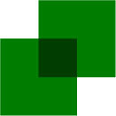
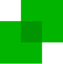
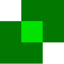
With all this talk of examples, we’d better have an actual one. Multiply is the simplest mode to demonstrate as it has the simplest equation: x = a × b, in which x is the resulting colour value, a is the top or active layer, and b the background. So, here are two green squares.

They have colour values of 0/125/0 − only the green channel has a value, to make this as simple as possible. Naturally, the top square is set to Multiply. So what’s going on at the overlap? First up, that 125 green value needs to be converted to a value between zero and 1. This gives us ~0.488. Therefore, the sum involved is 0.488 × 0.488, which gives us ~0.238, or a green value of about 61 between zero and 255, darker than the original colour, of course.
This works differently in CMYK, we should note, because of the differences between additive and subtractive colour. Ink values in a CMYK document don’t work on a digital scale of fixed levels, but an analogue one of ink saturation percentages. Say we have two squares in a CMYK document that are both 50% yellow, which gives us a sum of 0.5 × 0.5. The result is 0.25, but since we’re dealing with additive colour, this means more ink achieves a darker result: a value of 75% (zero would be 100% yellow). CMYK documents won’t be covered here because of these additional complexities.
Zero and One
Because a colour value of 255 equals 1 in the equation, and a value of zero equals 0 (of course), 255 will have no effect on the colour beneath (x × 1), and 0 will result in black (x × 0) if we ignore any other channel interactions.
An example with all three channels
Let’s do one more example of multiply with all three channels involved. The bottom square here has values of 180/120/60, the top square 200/80/220.

This means our sums are as follows:
Red = 0.78125 × 0.703125 = 0.54931640625
Green = 0.3125 × 0.46875 = 0.146484375
Blue = 0.859375 × 0.234375 = 0.201416015625
Multiply those results by 255 to once again get the 8-bit value, and resulting colour values should therefore be 141/38/52. Let’s flatten transparency and see if we’re correct.
Looks good! Excellent.
Blend modes in illustrator
Now let’s look at the individual blend modes in the order they occur in the Illustrator UI. In any equations listed, a is the active, foreground layer, b is the background layer, and x is the resulting colour.
Normal
No blending is applied and colours are opaque (unless you’ve modified the objects in other ways).
Darken
No sums needed in Darken, where the colour values are simply compared and the darkest ones kept. In the example here, a = 240/120/200, and b = 150/200/180, therefore x = 150/120/180.

Multiply
As we’ve already discussed, Multiply darkens colours with the formula x = a × b.
Colour Burn
A darkening effect, corresponding to a ‘burn’ in Photoshop. The formula here is 1-(1-b)÷a.

For two squares with 180 green, this gives us:
1 – 0.7058823529411765 = 0.2941176470588235
0.2941176470588235 ÷ 0.7058823529411765 = 0.4166666666666666
1 – 0.4166666666666666 = 0.5833333333333334
0.5833333333333334 × 255 = 149 (rounded)
This results in more darkening than Multiply at lower colour values, and less at higher values. At values above ~230 and below ~130, the results will be greater than 1 or less than zero, resulting in pure colour or black respectively.
Lighten
The opposite of Darken, of course. The colour values are compared and the lightest retained.
Screen
The usual counterpart to Multiply for highlights, the formula for Screen is 1-(1-a)×(1-b).

So using the 180 green example again:
1 – 0.7058823529411765 = 0.2941176470588235 (since our colours are the same, this value is, of course, both 1-a and 1-b)
0.2941176470588235 × 0.2941176470588235 = 0.0865051903114187
1 – 0.0865051903114187 = 0.9134948096885813
0.9134948096885813 × 255 = 233 (rounded)
Colour Dodge
The opposite effect to Colour Burn − think of the ‘dodge’ tool. The formula is b÷(1-a).

So for two squares of 120 green:
1 – 0.4705882352941176 = 0.5294117647058824
0.4705882352941176 ÷ 0.5294117647058824 = 0.888888888888888
0.888888888888888 × 255 = 226 (rounded)
As the inverse of Colour Burn, values above about 130 will result in pure colour.
Overlay

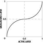
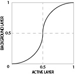
Colours with values lower than 0.5 have Multiply applied on a curved scale, and values over 0.5 have Screen applied the same way − basically, dark colours get darker and lights get lighter, and the effect is more extreme towards each end of the spectrum. The equation here is significantly more complex than the simpler lightening and darkening blends, and produces an S-curve (see below) where the extreme ends of the graph are full Multiply and Screen respecively.

Soft Light

The same principle as Overlay, but the effects of Multiply and Screen are halved, giving a more muted result (effectively a shallower S-curve).
Hard Light

This mode is the same as Overlay, but with the position of the active layer and background layer on the graph reversed, thus:

Difference

Subtracts colour values on the active layer from values on the background layer. If the number is negative, it is converted into positive. For example, given a background of 120 and an active layer of 180, the result is -60 − which becomes simply 60. If the number is positive, it remains so. The effect is that similar colours end up darker, and different colours edge towards the lighter end.
Exclusion

Exclusion has a rather more complex equation: 0.5-2×(b-0.5)×(a-0.5), but the result is comparable to Difference except that similar colours end up as a midtone (0.5).
Hue

The next four modes work by combining Hue, Saturation, and Brightness levels (HSB) rather than RGB values. Hue applies the hue value of the active object to the background object, and blends the saturation and brightness levels.
Saturation

Saturation applies the saturation value of the active layer, and blends the hue and brightness levels.
Colour

Keeps the hue and saturation of the active layer and the brightness of the background layer.
Luminosity

Keeps the brightness of the active layer and the hue and saturation of the background layer. The inverse of Colour.
The HSB-related modes don’t always give the numbers one might expect from their outcomes in the colour palette. I think this is because Illustrator is not carrying out the relevant maths on the HSB values, but on the RGB values still. This means the HSB sliders will display values that result in the correct colour output, but since this might be achieved with a spectrum of HSB combinations, the numerical result seen here is arbitrary − similar to the result seen if one views CMYK sliders for an RGB colour.
