A title column in InDesign with just styles

header image

I treat every InDesign document I make as a challenge. The goal of that challenge is to control everything with styles; if you can make a document with no local formatting, and no manual placement, then anyone can take it away and use it once you’re done. 99% of the time, this isn’t possible — there is almost always something to do after the scaffolding has been erected, some tweak the client needs that just can’t be consistent with everything else, or some design element that InDesign can’t quite achieve without your intervention. But many things are possible because of the vast amount of ways you can combine the options in styles, some of them unexpected.

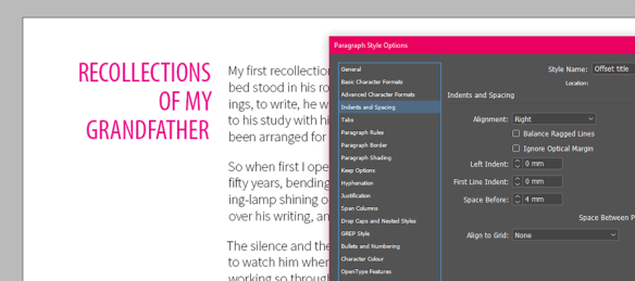
A title offset into its own column is something you might want to do for subtitles, quote callouts, or any situation where text that is supplementary to the body might be needed. Like many things, it can be achieved in a number of ways, but as you might have guessed we are going to do it with just styles. Up to a certain point, the process is simple — combine complementary indents with a baseline shift — but there’s a trick towards the end that I must credit to the brilliant Michel Allio, alias Obi-wan Kenobi. Have a read of this thread if you want it spoiled for you:

Column for heading, column for body text? – Adobe Forums

If you’d still like me to break it down for you, read on. I’m going to start by presuming you have some text you need to set; mine is something from Project Gutenberg. I’ll also presume you have some knowledge of InDesign.

The first thing we need is body text with a left indent large enough to create space for the titles. Create a paragraph style and give it a useful name; mine will just be ‘Body text’. Apply it to your story and then open up the indents and spacing options.

right indent body-para window

right indent body_Artboard 1

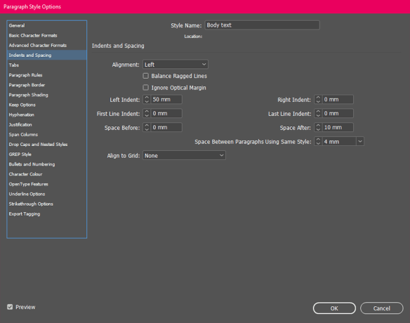
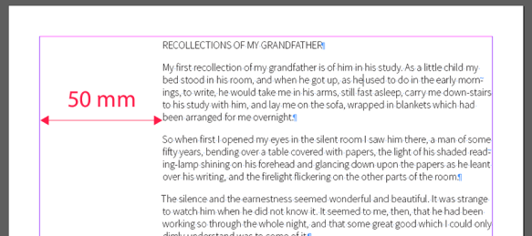
If you’re following along, set this to 50 mm. If you have your own layout in mind, set to whatever fits. The other settings are just things I added as I went along; they aren’t important for the effect.

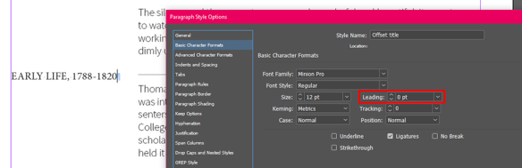
Create another paragraph style for the titles. Mine is called ‘Offset title’, but make it whatever fits your particular schema. Apply it to your titles. Now the real work begins.

One thing to note at this juncture is that the titles are, and still will be, part of the same story as your body text. They will occupy that space in between the body text paragraphs, even when it appears as if they are sitting alongside them. So, the first thing we need to do is ensure they do not visibly occupy that space, so that they don’t affect the space between body text paragraphs. To do this, they need to have leading set to zero — and, if you used another style as your source for this, ensure they have ‘space after’ set to zero too.

leading-0

Note that there is still space between body paragraphs here because I have it set that way in the body text paragraph style.

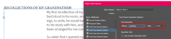
Before we move on, you may or may not notice that there is still space for the title text at the top of your text frame. This is because the ‘first baseline’ setting in the object style for the frame is probably set to ‘ascent’, which means it looks at the ascending characters in the typeface you’re using and sets the baseline as distance from the top of the frame to the bottom of those. We want it set to ‘leading’, which naturally means it is set based on the leading of the paragraph style you’re using. Since that is zero, the baseline sits exactly on the top edge of the text frame.

first baseline

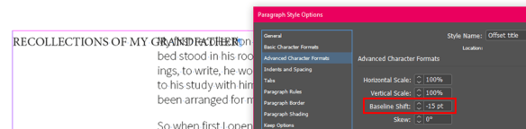
But the text still appears above the body text, and we want it alongside. For this, we need to apply an appropriate baseline shift to the offset titles paragraph style. If the titles and the body text are the same point size, this shift should look correct if it’s the same as the leading of the body text. The body text has leading set to 15 points. Set this as a negative value in the advanced character formats for the offset titles.

baseline shift

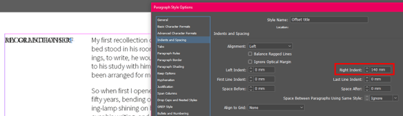
You may well want to increase this value so the top edges of the titles and the body text line up if you increase the size of the title text, but we can worry about that after learning the principles. With no leading and a negative baseline shift, the titles and the first line of body text will now overlap. We will stop this with a large right indent applied to the titles.

right indent

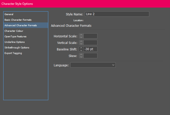
With no leading or other spacing, the paragraph just overlaps itself when it breaks lines! Solving this is the trickiest part. To do it, we need to create some new character styles. There needs to be as many character styles for this as there are lines on text in the longest title, less one; I expect my longest title to break into four lines, so I create three styles, named Line 2–4 (omitting line 1 because this will be controlled by the paragraph style alone).

Each of these needs to have a baseline shift applied that is a multiple of that of the paragraph style: Line 2 should have double (30 pts), Line 3 triple (45 pts), and so on.

character style

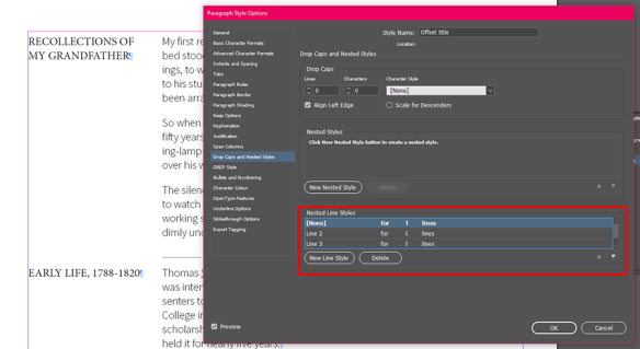
This is because these character styles are going to imitate leading for us, using line styles. Open up the paragraph style window for the titles again, and go to ‘drop caps and nested styles’. At the bottom you’ll find line styles. Add one using the style ‘none’ and set it to run for one line, then another using the style Line 2, again for one line. Repeat for as many lines as you need.

line styles

If you have ‘preview’ ticked, you’ll see the lines arranging themselves as you create each line style.

That’s basically it! Like many complex styles, it’s some work to set up, but of course if you do it right, you won’t have to set it up again. If you want to use larger text in the titles (as is likely), you will need to adjust the baseline shift settings for the title paragraph style and each character style to match. This example uses 24 pt type, and so has a shift of -24 in the paragraph style, and -48, -72, and -96 in the character styles.

final

Varying Transparencies in Live Paint

Something I hadn’t considered before it came up at work was that it might be useful to sometimes have areas of varying transparency in a single live paint group. Live paint is a useful shortcut in Illustrator that people probably take for granted now, but it was probably originally a way of making things in Illustrator a bit more Photoshop-like for newcomers. Before live paint, you’d probably construct everything you needed to fill as a closed path, which makes a bit of planning and close attention to the stacking order of objects essential for complex drawing. With live paint, you can just draw and let those things take care of themselves for the most part. Read up here if you’re unfamiliar.

Anyway, one thing you can’t do without breaking your live paint group into separate closed paths is adjust the transparency of individual filled areas. Not in the usual way, at least. You can still select individual paths (and the fills themselves with the live paint selection tool), but if you look at the appearance panel you’ll find you still just have the live paint group selected — there’s no way to add a stroke to an individual path either. Take this giant butterfly:

An image of a butterfly against a background of the sun setting behind pylons. This image will be used to demonstrate varying transparencies in live paint groups.

He’s a live paint group, of course. Say I wanted his colourful wing segments to appear transparent, but the dark areas to remain opaque. The first clue as to how you can go about this is here:

The butterfly image as a live paint group filled with various patterns

You can fill a live paint group with anything in the swatches panel, including patterns and gradients. Patterns can be transparent!  In fact, if you make a transparent filled object and drag it to swatches, a pattern swatch is what you get:

Creating a pattern swatch with transparency

It’s just colour; it’s only attribute as a pattern is that it has 50% opacity. So naturally, you create a set and colour away with the live paint bucket.

The butterfly live paint group, filled with some transparent pattern swatches

Looks delightful! However, there’s one pitfall I’ve found of this method. It’s quite a niche situation, but could be critical if you fall into that tiny niche and can’t figure out what’s wrong. Say you wanted to add a stroke around your butterfly. You’d add it in the appearance panel, drag it below the live paint contents so it doesn’t visually cover the whole group, and then set knockout group so it doesn’t show through the transparent areas (read more about the very useful option knockout group here).

butterfly-pylon5

Pretty silly, but that’s what you want for some reason. Looks fine in Illustrator, but you’ll get a hint as to what’s wrong with this if you check a preview of it in Bridge or your OS:

butterfly-pylon6

You can see the stroke through the transparent areas! Knockout group should prevent this, but for some reason it doesn’t. You’ll see the same thing if you place the AI file in InDesign, or if you export a raster file such as PNG. This is because other applications can only view the PDF side of the AI file, and while this method works fine in Illustrator, something evidently gets lost in the translation to PDF. This isn’t great news if you actually need to produce something using this method!

Fortunately, there’s another way. Remember that you can add gradients to the swatch panel too, and these can also contain transparency. Obviously you could have any combination of transparent gradient stops, but if you just want to replicate what we’ve made above, you’d need a gradient with two identical stops, with the same opacity setting.

butterfly-pylon7

A bit of a pain, and rather odd, But for whatever reason, this setup translates fine into the PDF, and makes an image created in this way usable elsewhere.

Compound paths and you

Compound paths are a fundamental aspect of Illustrator drawing (and other vector drawing), but given the amount of questions I get about them at work, perhaps not intuitive to understand. I made this as a brief run-down of how compound paths work and how to work with them for my colleagues; maybe you’ll find it useful too.

For the most part, compound paths are about making holes in things. Here the two circles become a compound path; the smaller circle cuts its area out of the larger one, and you can see the yellow box in the centre as a result.

Asset 1@2x-8

Make a compound path by selecting the objects you want to become one and use the menu via Object > Compound Path > Make, or press Ctrl + 8.

Asset 13@2x-8The Pathfinder can also be used to make compound paths. In this case, Minus Front and Exclude would have the same effect as above.

You can use any number of shapes of any complexity in a compound path with the same effect. You can also use shapes that overlap each other − but that’s where things get more complex.

Asset 3@2x-8

Here two overlapping circles form a compound path. The area of their overlap is excluded from the shape’s fill, as you might expect:

Asset 4@2x-8

But these circles are also a compound path, and their entire area is filled, including the overlap. What’s going on here?

Asset 5@2x-8

The answer lies in the relative directions of each circle’s path. Every path has a direction, usually going from its start point to end point. In closed shapes made with the shape tool, the direction is anticlockwise. Here I have given each circle an arrowhead so we can see the path direction:

Asset 6@2x-8

Compound paths, by default, use something called the Non-Zero Winding Fill Rule to determine which overlapping areas are filled and which aren’t. You can see this in the Attributes panel. In two newly-compounded shapes, the bottom one in the stack order will reverse direction, and the opposing directions of the two paths result in the overlapping area being excluded from the fill:

Asset 7@2x-8

You can change the direction of a path in the Attributes panel too. Direct-select one of the paths and use the Reverse Direction button (this only applies to paths as part of a compound paths; reversing the direction of regular paths is possible via the menu Object > Path > Reverse Path Direction). As the paths are going in the same direction, the rule determines that the overlapping space is filled:

Asset 14@2x-8

Note that shapes that have been ‘uncompounded’ (that is, released) appear to remember that they had their path directions altered and honour that setting − so effects like the lower path reversing direction might not occur if they are incorporated into other compound paths.

The Non-Zero Winding Fill Rule has a limitation shown here. What if three or more shapes overlap? They can’t all go in opposite directions, right? So some overlap areas end up filled while others aren’t.

Asset 8@2x-8

For situations like this, there is the Even-Odd Fill Rule. Here path direction is irrelevant and what matters is the number of objects that overlap. Odd numbers of objects will create filled areas, and even numbers unfilled areas.

Asset 9@2x-8

In some cases, it might be necessary to switch rules to ensure the effect you want, especially in objects with many shapes, where the Non-Zero Winding Fill Rule may create unpredictable results.

Asset 10@2x-8

Consider this situation. There are several red shapes on top of the large red circle in the stack order, but a single green square below it. When you make a compound path from the shapes within the large circle’s area, only the bottom square is excluded from the fill and the whole lot becomes green! Why?

Asset 11@2x-8

Remember that only the bottom shape in the stack order reverses direction, so every other shape has the same path direction as the large circle. And as we are now aware, the compound path takes on the appearance attributes of the bottom object.

Asset 12@2x-8

Switching to the Even-Odd Fill Rule in this case produces the desired result.

It’s these fill rules that seem to give users the most problems, especially if one of the inner objects was drawn first. If you do a few experiments and reinforce for yourself what each rule (and changing path direction) does, you’ll find yourself solving these problems without even thinking about it.

Spray the spines on to a hedgehog

Recently I had occasion to draw a hedgehog tentatively handing his car in for an MOT, as hedgehogs sometimes need to do.

hedgehog-MOT-01

Doodling a hedgehog is simple enough, but how to take a holistic approach to drawing hundreds of spines? There are already a few different art brushes here to give his fur a bit of furriness, but I don’t think we want to be drawing an individual path for every spine too. Here’s how he looks without them:

nospines-02

At the moment he’s a sketch with a calligraphic brush (the black lines), filled shapes for the darker and lighter areas of his body (the brown shades), and some art brushes from Adobe’s Artistic_Paintbrush set to give him a bit of fluffyness (hedgehogs aren’t entirely spiny after all). So what tools do we have that can create and modify hundreds of objects at once?

The Symbol Sprayer tool!

Most approaches to drawing in Illustrator tend to be quite methodical — you draw in layers of discrete shapes, and people who come to it expecting to sketch and paint like they might in Photoshop can quickly hit brick walls with this approach. To me, the symbol sprayer always seemed a bit incongruous in this environment. What use could there be for something that randomly plasters your artboard in symbols? Well I finally found one. The key here is there is a set of tools behind the basic sprayer for modifying the symbol set (as it’s termed) after the fact. But firstly, we need a symbol to work with.

spine

This is just a symmetrical shape with a gradient fill, a couple of millimetres wide in our A4 document. Now we can get spraying.

spray

Go nuts with it. Set the density options (double-click on the tool) as high as they go and cover him. Use the square bracket keys to increase or decrease the size of the brush. Here the spin (rotation) is set to ‘User Defined’, so it initially appears random. After that it’s time for the scruncher.

scrunch-shift

This drags symbols towards the centre of the brush. Use it to pull any outliers into the large brown area of his back. Spray and scrunch until you have a decent density of spines, and your hedgehog will either have absurdly neat upright spines (if you left Spin as ‘Average’) or a complete mess (if you set Spin to ‘User defined’):

mess

I don’t think we can in good conscience leave him like that. Next up is the Symbol Spinner. This tool drags symbols to face the direction of movement of the brush cursor, so you can effectively comb him by dragging the cursor over the symbol set. Note the direction arrows that appear on symbols within the brush area:

brush

Just keep brushing him down until you have a nice neat hedgehog, who might feel a bit more confident about getting his car back:

neat